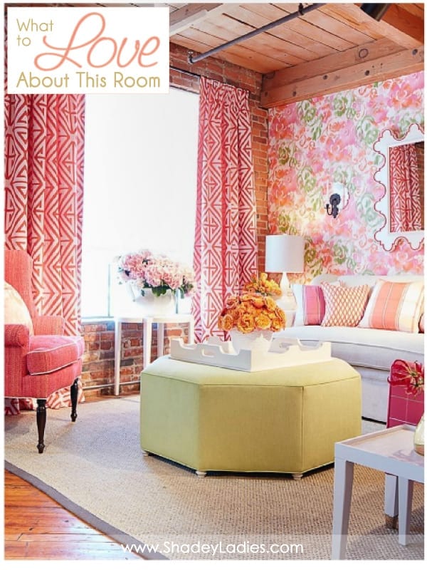
I reallllly like this room. Even though the main color is pink, I don’t actually think it’s overly feminine. Here’s why…
I like the contrast of the feminine pinks with the masculine textures used throughout. If I had to break it down and get specific, here’s what I especially like about this room…
- BRIGHT and airy
- Feels ‘HAPPY’
- Use of ORGANIC products – brick, wood, pipe
- Excellent play on TEXTURE & contrast – cool metal pipes, warm wood ceiling, soft drapery fabric, rough brick walls
- Lots of ‘POP’ & eye candy
- Excellent and balanced selection of PATTERN – floral wallpaper, geometric fabrics, striped pillows
- Use of more ‘masculine’ products such as the piping, wood, brick, etc. tones down the femininity of the color pink
- The UNEXPECTED pop of color in the chartreuse ottoman
- I love the drapes!
I will say that there is one thing I’m not particularly fond of in this room… can you guess what it is? It’s the mirror on the wall. I’d prefer to see something a bit more sophisticated and simple. With all that’s going on in the room I think a larger mirror with a simple white frame would be stunning!
What do you like / dislike about this room? Do you like the use of all the textures? Do you think there’s too much pink? Let me know in the comments below…